Predicting Employee Attrition Using Machine Learning

Introduction
Employee attrition is a reduction in numbers of employees in an organisation as a result of resignation, retirement or death. Our main focus will be on employees who decided to leave an organisation by resignation. We are going to explore available data using statistical techniques and predict the factors that are responsible for why employees quit their organisation.
- 1 Why do employees choose to leave?

There are so many reasons why employees do quit their organisations. There is a saying that ‘people don’t quit their job, they quit a boss’. This is not always the case all the time. An employee might quit his or her job when they feel that their values are not needed; when they feel their work does not fit well with their interests, when they have not been promoted or if there are no career development opportunities.
Also, there is high attrition when employees feel they are not well paid or when they spend more money on transportation to their place of work because of the distance from home or they have more overtime. Keeping the employees satisfied by the organisations is a big challenge. Whatever the case might be of the employees leaving. It is high time companies started paying more attention to their employees and engage them in more skill acquisition programs which will be beneficial to their career path and as well be profitable to the organisation.
It is imperative for organisations to also look into the fact that their intellectual properties might be at risk and it will cost them more money in recruiting new people.
1.2 Our Goal
Our goal is to use data exploration and analysis techniques with different machine learning algorithms to predict the main factors that are responsible for why employees quit their jobs in an organisation.
Let’s get our hands dirty with the fictitious HR Employee Attrition dataset created by IBM.
1.3 Import Libraries
The very first thing to do is to import all the required libraries.
import pandas as pd
import numpy as np
import seaborn as sns
import matplotlib.pyplot as plt
%matplotlib inline
1.4 Import Dataset
This is where your machine learning journey begins, so let us start to import our HR Employee Attrition dataset. We will be using the Pandas library in Python to explore the dataset. The NumPy libraries can also be used to read the data as a NumPy array.
The dataset that we are going to use is quite small, it comprises of 1,470 rows and 35 columns. The dataset also contains both numerical and categorical variables.
Here, we will use the read_csv() of the Pandas library to access the data since it has been saved as a comma-separated variable (CSV) file during the data munging process.
- data = pd.read_csv(‘.csv’)* — This is a name variable where the DataFrame is now stored. You can use any desirable name.
data = pd.read_csv(‘C:\\...ML-Doc\\HR-Employee-Attrition.csv’)C:\\…ML-Doc\\ is the directory path where the file is stored.
2. Exploratory Data Analysis
Exploratory Data Analysis (EDA) is a statistical technique used to analyse datasets, handle missing values, identify errors/anomalies and evaluate the relationship between exploratory variables using visual methods. The main purpose of EDA is to explore what the data can tell us beyond the standard modelling or testing of hypotheses.
The column function shows all the column names within the dataset:
data.columns
We can perform a lot of functions using pandas libraries to give us more information about our dataset. Let’s check a few rows of the dataset using a pandas function .head() and .tail().
data.head()
Running the data.head() shows us the first 5 rows of the dataset with 35 columns. To display the last five rows see code below.
data.tail()
#Grabbing the first 5 rows of more than one column.data[['Attrition', 'Age', 'Gender', 'YearsAtCompany', 'MonthlyIncome', 'MaritalStatus', 'JobSatisfaction']].head()

#This stores the number of rows (1,470) and columns (35) as a tuple.data.shape

#Another important function of Pandas is the .info() function - This shows the datatype for each column of your dataset.data.info()

2.1 Counting the missing values
#To check for NAN values in each column. This generates a count of how many missing values our DataFrame has per column:data.isnull().sum()The good news is that our data does not contain missing values. Learn more on handling missing values.
2.2 Unique values of the column
data.nunique()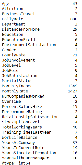
2.3 Feature Selection
The EmployeeCount, EmployeeNumber, StandardHours and Over18 features are not important to us.
#Lets remove them from the dataset using the .drop function with the axis set to equal 1. To make this changes take effect immediately we will use inplace=True.data.drop('EmployeeCount', axis=1, inplace=True)
data.drop('EmployeeNumber', axis=1, inplace=True)
data.drop('StandardHours', axis=1, inplace=True)
data.drop('Over18', axis=1, inplace=True)
# Total number of employees by JobSatisfaction.data['JobSatisfaction'].value_counts()

# Percentage of employees by JobSatisfaction.data['JobSatisfaction'].value_counts(normalize=True)*100

31.22% of the employees have very high job satisfaction while 19.65% of the employees have low job satisfaction.
# Total number of employees by BusinessTravel.data['BusinessTravel'].value_counts()

# Percentage of employees by BusinessTravel.data['BusinessTravel'].value_counts(normalize=True)*100

As we can see above, 70.95% (1,043) of the employees rarely travel while 18.84% (277) travel frequently.
#Total Number of employees who stayed (No) and those who left (Yes).data['Attrition'].value_counts()

# Percentage of Attrition.data['Attrition'].value_counts(normalize=True)*100

The total number of employees who quit is 16.1% of the total employment while the number of employees that stay is 83.8%. This means that we have an 83.8% chance of guessing correctly that an employee will stay.
We can also use the below code to show the value counts of all the categorical attributes just as we did above.
for column in data.columns:
    if data[column].dtype == object:
        print(str(column) + ':' + str(data[column].unique()))
        print(data[column].value_counts())
        print(data[column].value_counts(normalize=True)*100)

print('___________________________________________________________')
# Transform the target attributes (Attrition) from non-numeric to numeric.
Attrition_Transform = {‘Yes’: 1, ‘No’: 0}data['Attrition'] = data['Attrition'].map(Attrition_Transform)# Total number of Attritiondata[‘Attrition’].value_counts()
As we can see below, the attrition has been changed from non-numeric to numeric:
data.head()
Attrition = data.groupby('Attrition')
Attrition.mean()
- The average age of employees who quit/left is around 33.6 years while the average age of those who stayed is 37.5 years.
- Average monthly income of employees who quit is $4,787 compared to those who stayed ($6,832). At this point, employees who are within the same age group might be feeling bad that they earn less than their other colleagues of the same age group.
There a lot of information we can infer from the above code.
# The describe function gives us the summary statistics (count, mean, standard deviation, min and max, the quartile values) for each column.data.describe()

MaritalStatus = data.groupby(‘MaritalStatus’)
MaritalStatus.describe()
Department = data.groupby(‘Department’)
Department.describe()
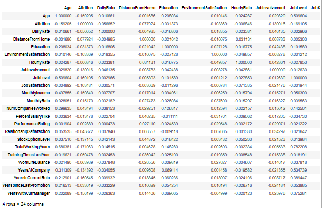
# let’s get the correlation of the attributesdata.corr()
3. Data Visualisation
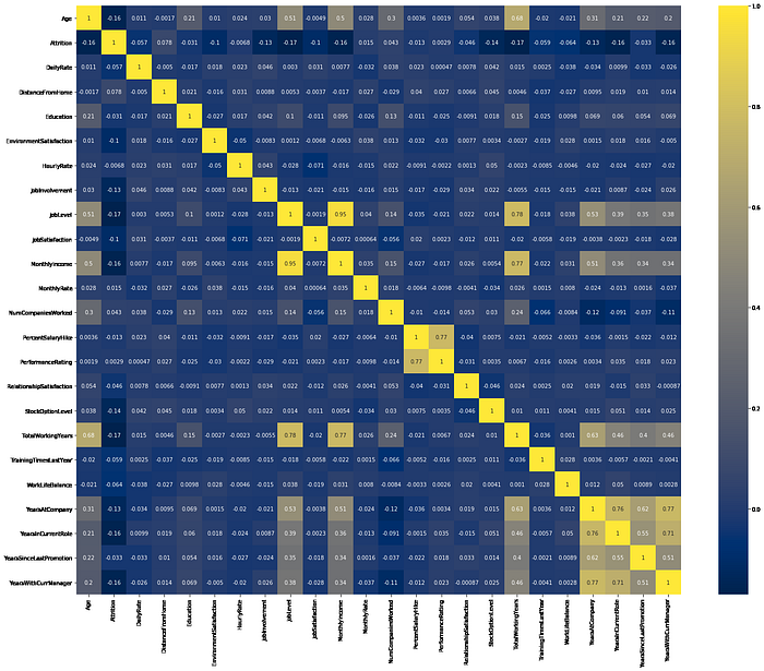
To get a more detailed understanding of the data, it is important to analyse the data critically using the right visualisation process. Let’s visualise the data.
# Heatmap: This help with feature selections.plt.figure(figsize=(25,20))sns.heatmap(data.corr(),cmap='cividis', annot=True)
data.hist(bins=50, figsize=(20,15))
plt.show()
3.1. Visualizing Histograms

As we can see above most of the variable distributions are positively skewed, this means our distributions are neither symmetric nor normal because the data values trail off more sharply towards one side of the graph than the other side. You can run the code below for other variables to see which of them is positively or negatively skewed.
#Skewness and Kurtosisprint("Skewness: {:0.3f}".format(data['MonthlyIncome'].skew()))
print("Kurtosis: {:0.3f}".format(data['MonthlyIncome'].kurt()))

# Plot boxplots of numerical columns.attributes = [
    'Age', 'DistanceFromHome', 'JobLevel',
    'JobInvolvement', 'YearsAtCompany', 'YearsWithCurrManager',
    'YearsInCurrentRole', 'TotalWorkingYears', 'MonthlyIncome'
]f, ((ax1, ax2, ax3), (ax4, ax5, ax6), (ax7, ax8, ax9)) = plt.subplots(3, 3, figsize=(20, 25))
ax = [ax1, ax2, ax3, ax4, ax5, ax6, ax7, ax8, ax9]
for i in range(len(attributes)):
    sns.boxplot(x = 'Attrition', y = attributes[i], data=data, ax=ax[i])

plt.figure(figsize=(12,6))
sns.boxplot(x='Gender', y='Age', hue='Attrition', data=data)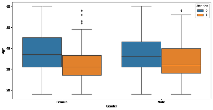
features = ['Age', 'DistanceFromHome', 'YearsAtCompany',
             'YearsSinceLastPromotion', 'Attrition', 'JobInvolvement',
             'JobLevel', 'JobSatisfaction', 'MaritalStatus',
             'Gender','BusinessTravel', 'Department']fig=plt.subplots(figsize=(25,18))
for i, j in enumerate(features):
    plt.subplot(4, 3, i+1)
    plt.subplots_adjust(hspace = 0.8)
    sns.countplot(x=j,data = data, hue='Attrition')
    plt.xticks(rotation=90)
    plt.title("No. of employee")

from sklearn import metrics
from sklearn.metrics import accuracy_score
from sklearn.metrics import confusion_matrix
from sklearn.metrics import classification_report
from sklearn.model_selection import train_test_split
from sklearn.preprocessing import StandardScaler
4. Preprocessing
4.1 Encoding Categorical Features
Let’s convert the categorical features from text to number using Scikit-Learn LabelEncoder since the machine learning algorithms require numbers as inputs (machine only understand numbers not text).
# Import LabelEncoder
from sklearn import preprocessing#creating labelEncoder
le = preprocessing.LabelEncoder()# Convert string labels into numbersdata[‘BusinessTravel’]=le.fit_transform(data[‘BusinessTravel’])
data[‘Department’]=le.fit_transform(data[‘Department’])
data[‘EducationField’]=le.fit_transform(data[‘EducationField’])
data[‘Gender’]=le.fit_transform(data[‘Gender’])
data[‘JobRole’]=le.fit_transform(data[‘JobRole’])
data[‘MaritalStatus’]=le.fit_transform(data[‘MaritalStatus’])
data[‘OverTime’]=le.fit_transform(data[‘OverTime’])
data.tail() # As we can see all the categorical variables has been converted from text to numbers.
4.2 Data Splitting
# Split the data into independent 'X' and dependent 'y' variables.X = data.drop('Attrition', axis = 1)
y = data['Attrition']
5. Select and Train a Model
# Split the dataset into 75% Training set and 25% Testing setX_train, X_test, y_train, y_test = train_test_split(X, y, test_size = 0.25)
6. Training and Evaluation
from sklearn.naive_bayes import GaussianNB
from sklearn.neighbors import KNeighborsClassifier
from sklearn.ensemble import GradientBoostingClassifier
from sklearn.ensemble import RandomForestClassifier, AdaBoostClassifierclassifiers = {
    'Naive Bayes': GaussianNB(),
    'AdaBoost': AdaBoostClassifier(),
    'KNN(3)': KNeighborsClassifier(3),
    'Random Forest': RandomForestClassifier(max_depth=7, n_estimators=10, max_features=4),
    'GradientBoosting': GradientBoostingClassifier(random_state = 10, n_estimators = 400, learning_rate = 0.04, max_features = "sqrt")
}
6.1 Model Fitting and Predictions
for name, classifier in classifiers.items():
 classifier.fit(X_train, y_train)
 score = classifier.score(X_test, y_test)

 y_pred = classifier.predict(X_test)

 # Model Accuracy, how often is the classifier correct?

print(‘{:<10} | accuracy = {:.3f}’.format(name, score))

# Model Precision

print(‘Precision:’,metrics.precision_score(y_test, y_pred))

# Model Recall

print(‘Recall:’,metrics.recall_score(y_test, y_pred))
print(confusion_matrix(y_test, y_pred))
print(metrics.classification_report(y_test, y_pred))
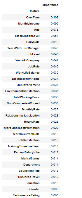
7. Feature Importance
# Return the feature importance (the higher, the more important the feature).
importance = pd.DataFrame({‘feature’:X.columns,’importance’:np.round(classifier.feature_importance_,3)}) #Note: The target column is at position 0
importance = importance.sort_values(‘importance’,ascending=False).set_index(‘feature’)importance
importance.plot.barh(figsize=(18,8))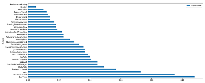
8. Model Result
Our model was trained and evaluated with good performance of 86% accuracy. Prediction is correct only 65% of the time when it predicts employee attrition on test sets.
9. Findings
- Using different algorithms, we found out that GradientBoost and AdaBoost performed best with an accuracy score of 87.8% and 87.2% respectively. While KNN is the least performing classifier with 80.7% accuracy.
- OverTime, MonthlyIncome, Age and StockOptionLevel are the major factors that are responsible for why employees quit his or her job in an organisation, while the least factors are PromotionRating and Gender.
- Employees with no performing rate are less likely to quit.
10. Conclusion
In conclusion, you have learnt how to load data. To gain some insights, we used a statistical technique to explore, manipulate, visualise and analyse the data. Also, We pre-processed the data by transforming categorical variables into a numerical variable then we selected and trained a Machine Learning model using different algorithms. Finally, we conducted statistical classification methods, evaluate our model and determine the major factors that are responsible for why employees quit their jobs in an organisation.
Our model result shows that GradientBoost performed best among other algorithms with 87% accuracy.
11. Recommendations
For other beginners like me, I recommend taking a look at ROC and AUC to determine which of the models is the best predictor. There is still room for improvement in the area of parameter tuning as well.

12. References
- Employee Churn Model with a Strategic Retention Plan: an HR Analytics Case Study
- Handling Missing Values
- IBM HR Analytics Attrition Dataset Source
- Predict Employee Attrition
- Predicting Employee Churn in Python
Thanks for reading this far. I hope have given you some understanding regarding exploratory data analysis and data modelling.
For the complete python code, please refer to this GitHub repo.
